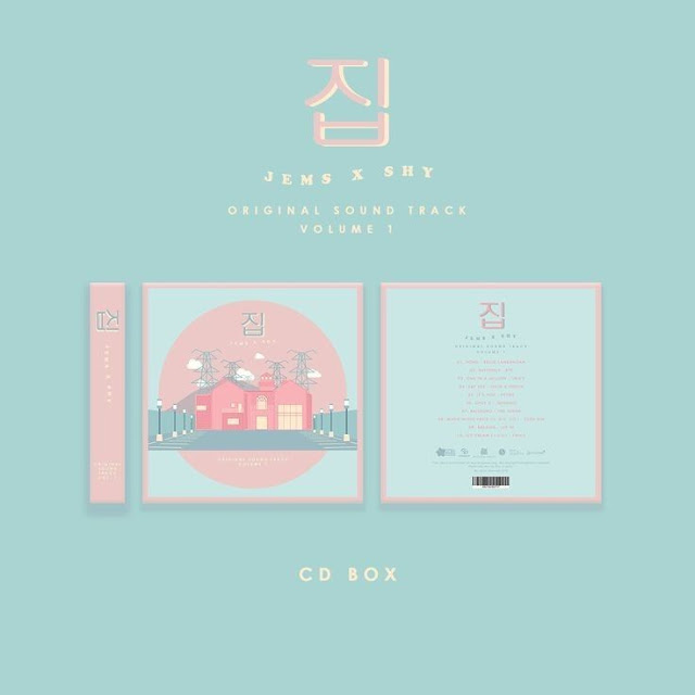
This is the research and development of our digipack, at current stage of research, will include mockups of future designs. All of the photos and information below have been compiled by me.
Most of the resources I have researched were from the platform pinterest. I was going through photos in other search engines such as google yet to find the aesthetic we are looking for, the pinterest platform was the best in giving results.
Reflection: Based on the photos above, artists usually have their albums set with a certain color and style which we plan to incorporate in our project. Right now, as we have decided to take shots on a film camera it may be possible to create a vintage theme in our cover, hence I put forward the idea of maybe having a vintage scrapbook concept, it would be easier to create and the amount of possibilities to create doodles and have stickers might give it an edge. Based on a lot of the young artists I have research, it is trendy nowadays to include minimalistic designs yet have the star to be the centre focus instead of a maximalist design that may draw attention away from the artist. I went back and added some more into my research as my teacher suggests that I look for more that suits my genre and add comments into the usefulness of my research in each piece.
 |
| I loved the simple, elegant design. The minimal color pallette also did not distract from the main point of interest of the album. However, the color is too light and did not suit the theme we were looking for which is dark and there's so much white space that makes the design look empty. However, when playing with the color palette this helped in creating an idea for how our digipak is going to look like. |
 |
| This design is unique, and the bold sketches and colors really pop out. Although a vinyl and not a digipak, I feel like it would suit how our design could look. The minimal colors and more emphasis on the images/logos gives me an idea to create a point of interest that's similar in my digipak design. However, the three colors used were too small of a pallette for my personal taste, I would prefer 5 main colors so that it's not lacking the vibrant element as seen in genre conventions. |
.jpeg) |
| The minimalist design here was also done well, however, the lack of colors made it hard to use this as a good reference for the digipak. The pictures and textures stood out to me however, with the emphasis on a soothing aesthetic that I want to incorporate into our design. |
 |
| This design is quite similar to the last few with the three main colors and simple design however the typography on the front really stood out to me and I loved how you can make something simple a point of interest, with the main focus on the image and font. I want to incorporate a similar design into my digipak. |
 |
| This design is quite different with the variety of colors on the cover which I liked since the last few designs lacked color, however the black ties it all in which I liked. We can see the point of interest clearly with the image on the front and the black and green are used really well as we can see it popping out. The elaborate design is quite nice, however with the timing being quite short, it may not be possible for us to create such an elaborate design and may be out of budget. Hence, we'll be taking the colorful element but not the picture element.
|
 |
| I loved the elaborate pictures used on the cover and cd here. I want to stick to one main color which is the purple neon lights being used in the mv which can tie back into this, however I feel as though the color makes it too monochromatic and I want to create something more dynamic, it helped generate how I want to map out the layout for the digipak however, it was not enough to suggest a strong enough reference for the final piece. |
Smaller research
DIGIPAK RESEARCH COVER 1
 |
This are some of the main images and album covers I've found that fit the genre conventions of R&B and rap, as you could see above, there is minimal color, a darker color palette the poses are laid back and the typography is not emphasized which may be important for the design I'm creating.
DIGIPAK RESEARCH COVER 2 |
 |
I branched out more into other genres in this research here, however, I tried to search for some albums with vibrant colors. I found some images that matched the vibes of our music video which helped in aiding ideas for the final design.
Development Digipak

These were some of the mockups we made with reference poses from the internet, the first few ideas were severely lacking the aesthetic we wanted to go for. We experimented with the typography and the layout of how we were going to place the artist the parental advisory logo. When I was creating these designs me and my teammate Jason created these mockups, we focused on having one image that stood out supported with color such as purple/blue.

This picture shows the mockups of the layout designs we were thinking of, at first we were thinking of taking inspiration from a drake album however, as time went on we realised that the idea was quite outdated and overused, so we changed the design and took inspiration from some K-pop albums as seen below.

These were the final drafts of the front cover design. These were made by me, Jason and Niki. Niki figured out how to do the glitch effect which pulled the design together really well. We were also contemplating on whether to include three "jun" or artist names in the front or one. We asked around the school and took a poll, we also took advice from our teacher for the revision, with the one "jun" word being most popular and being the final design.
These were some of the drafts of the inside cover, I took the picture at my house near sunset. We were thinking of whether to put the producers in this section or the track list, which we experimented on as seen above. However we decided on the final draft below to include the track list instead. Me and Jason created this piece.
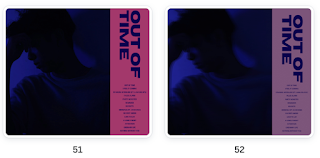
This is the final design of the inside cover, we used the glitch and duotone effect on Canva and it brought the piece together better as it fit the front cover and stuck to the color scheme of pink, purple, and blue. To mimic the neon lights we used, we incorporated the light effect on the "out of time" title. The white matched the design the best for the title track below, we thought of using pink however, it drowned out in the design and we decided not to end up using it.
This is the final design on the back cover, we experimented with the colors used however as we stuck to the bright pink in the last picture, we went with the first picture.
Reflection: Based on the designs that we made, we could've created better with a bigger budget and timeline however, with given circumstances I'm happy with how the results turned out. I learned a lot of effects on Canva and learned graphic design elements which I could implement in the future as a result. The branding research that I did definitely helped with a sense of vision and purpose in this album, the research helped develop a design that ties back into the social media and the music video. |


.jpeg)


Comments
Post a Comment